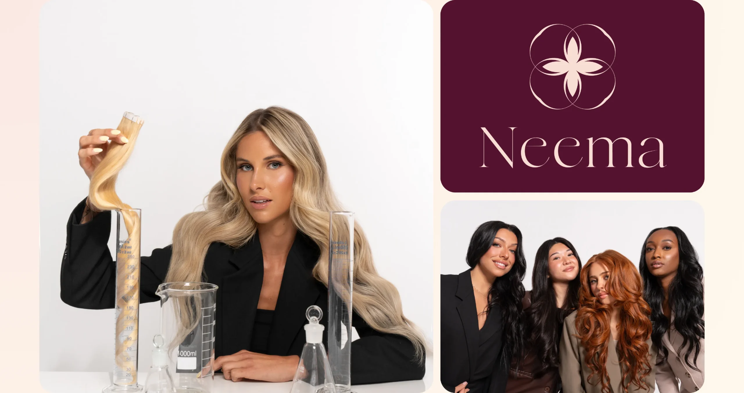
To make health a condition of beauty.
what existed
Personal experience. Scientific expertise.
The founder, Lydienne, was already intimately familiar with the role that extensions can play in self-confidence.
She was also familiar with the industry.
Then his scientific background gave him a different perspective on treatments, ingredients and the invisible risks behind certain products.
Maison Neema was born from the convergence of these two experiences.
Lydienne is also a co-founder of Noro: here, the atelier shaped the brand of its own formulator.

what no longer held
Luxury was no longer enough.
A beautiful extension could be soft, shiny and perfectly applied — while leaving its origin, treatments and what it actually brought into contact with the body invisible.
Creating a new brand was therefore not about making the offer more desirable.
The brand needed to be more demanding.
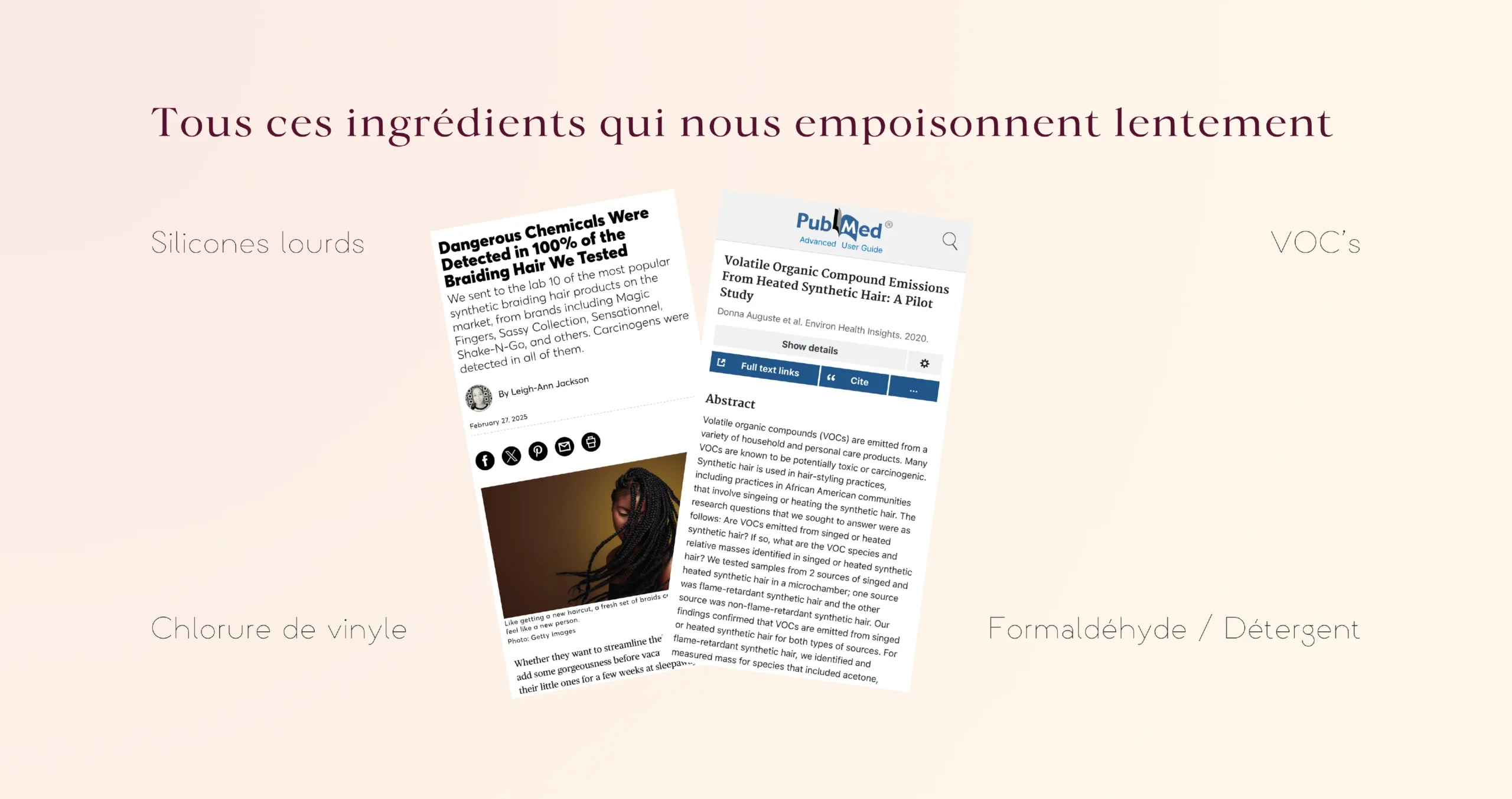
what we understood
Beauty and health should no longer be two separate conversations.
Maison Neema promises women more control over what they choose to wear.

what we have chosen
Safe. Healthy. Secure. Flexible.
These adjectives structure the promise: they organize what quality means at Maison Neema, from the consistency of the product to the absence of problematic substances and the natural movement of the hair.

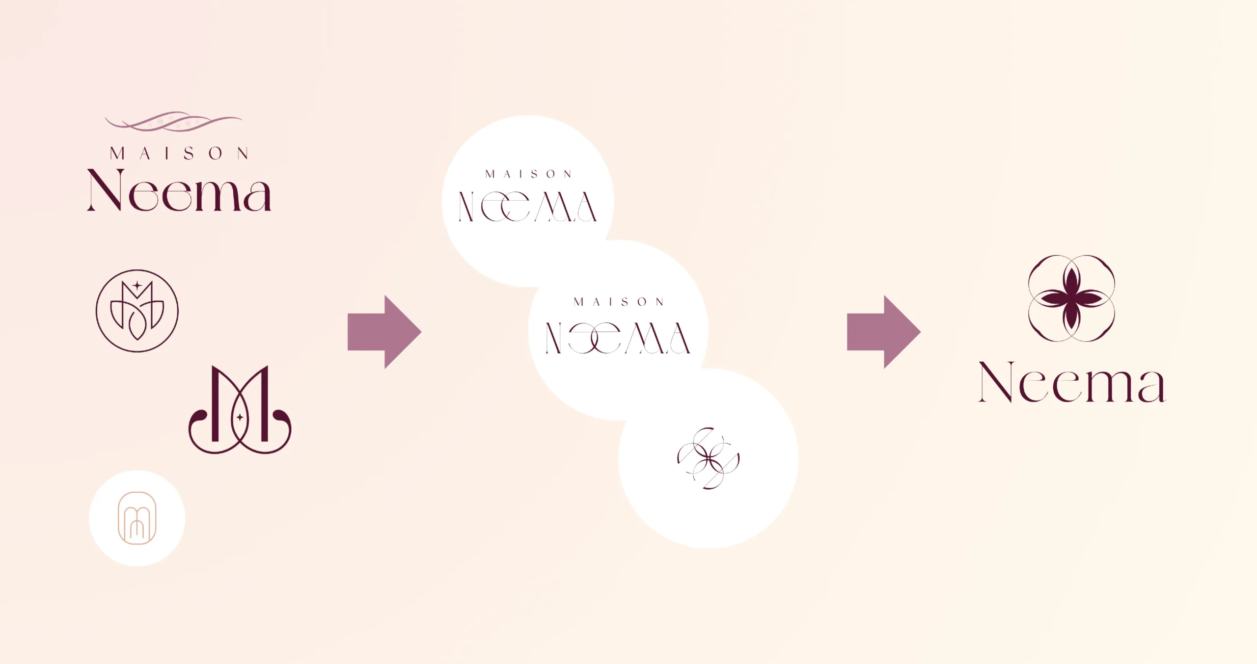
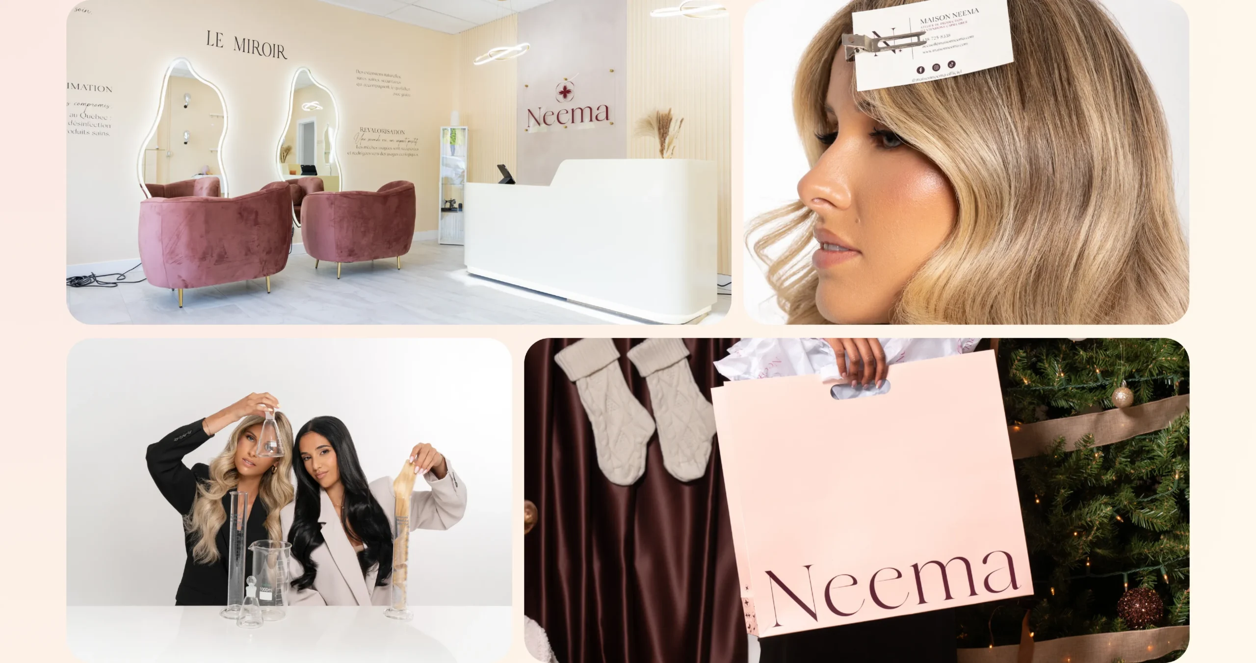
We were looking for a flower. A flower that we couldn't draw.
The founder wanted a flower. Several internal and external proposals were tested; we even explored waves and Adinkra symbols. The solution finally emerged by working on the typography of Neema : shapes derived from a letter, reversed and flipped, created the desired flower.
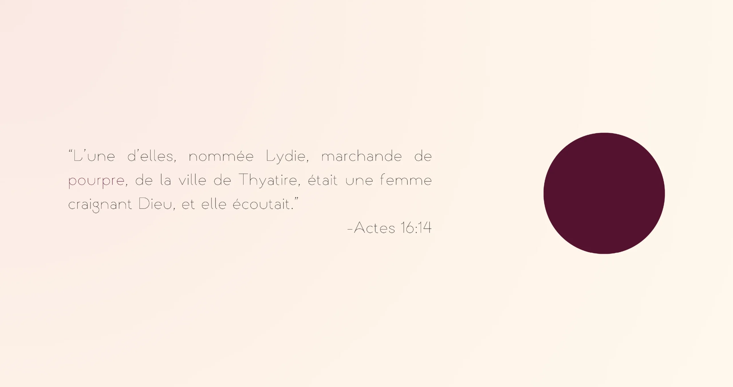
The purple was there before everything else.
It comes from Lydia of Thyatira, a purple merchant: a figure of an independent and devout businesswoman who resonated with the vision carried by Maison Neema.
This color has become the anchor point of identity.
Around it, we built a softer palette: powdery pink, satiny peach, sun-kissed kiss, linen, and muted greens. Shades that bring skin, light, and natural materials into the brand's universe.
The purple gives it its depth.
The other colors give it airiness.
Together, they allow Maison Neema to be feminine without being fragile, refined without being distant, natural without becoming rustic.

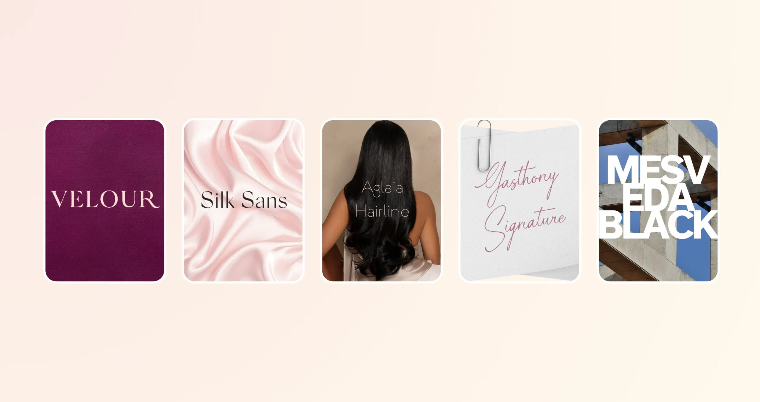
The typography should be felt as much as it is read.
We have built a typographic vocabulary in which each character brings a different quality: depth, finesse, structure, movement.
Velvet It carries the grand titles with something understated and noble. Silk Sans Display introduces more breathing room and precision. Aglaia Hairline, Fine and slender, it almost evokes the lightness of a hair. Then the calligraphy of Gasthony Signature occasionally adds a more intimate gesture, like a trace left by the hand. The system is complemented by Mesveda Black when the brand needs more impact and structure.
what took shape
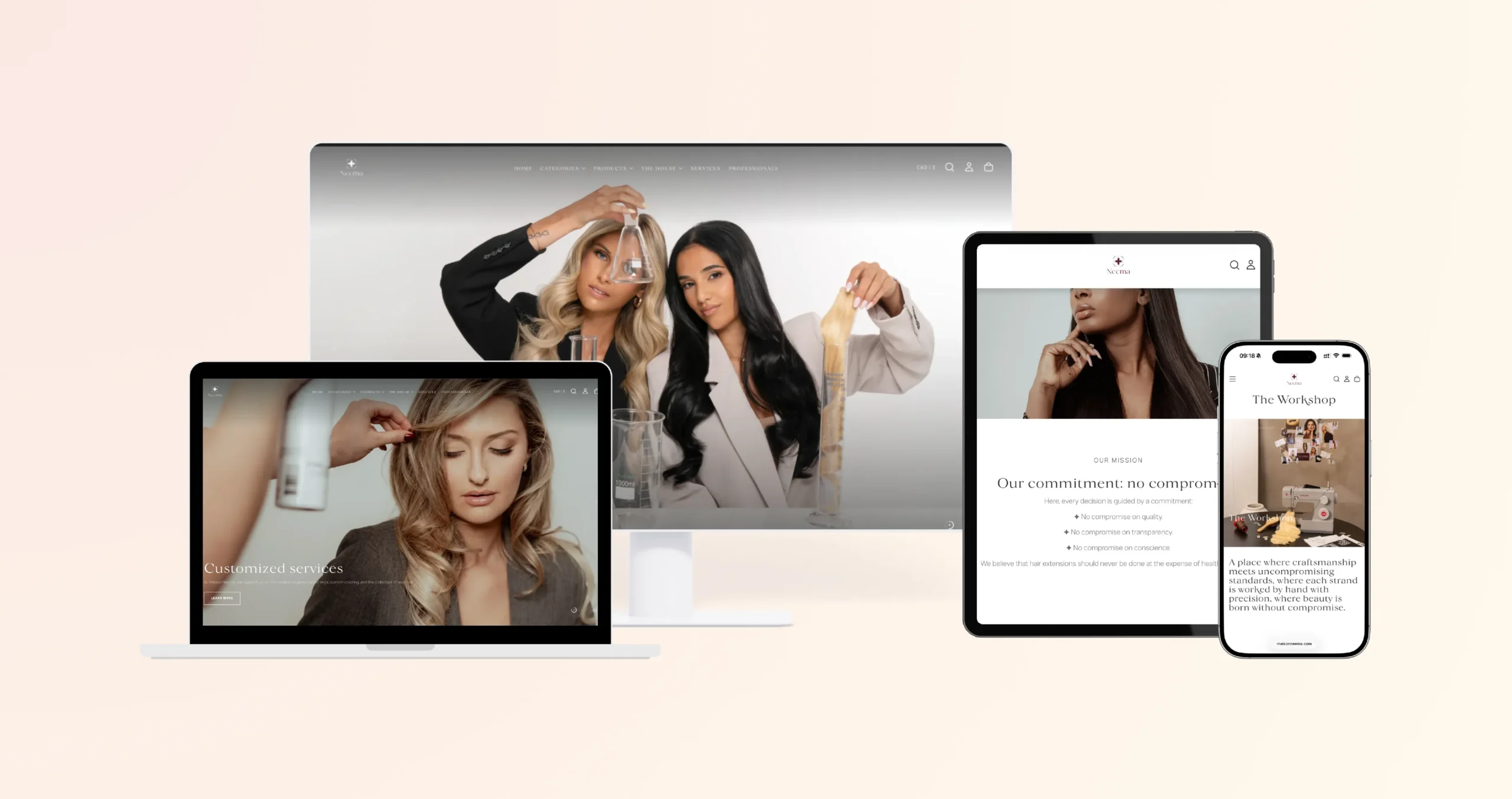
Commerce should be able to inform as much as it sells.
Identity has been translated into an experience where one can enter through the product, through one's need, through a method of application, or simply through the desire to understand.

The system was not designed for a collection.
It was designed for a specific requirement.
Every new product can now be evaluated using the same question:
Does this truly respect the woman who will wear it?
what it changed
Maison Neema holds together what its sector often separates: desirability and transparency, sensuality and rigor, luxury and responsibility.
The brand has a language to sell, inform, advise and evolve without having to choose between its scientific and emotional aspects.
She no longer asks women to choose between being beautiful and taking care of their health.
